In an age when car cabins were starting to resemble iPad showrooms, one humble hero is staging a comeback: the physical button. Once dismissed as old-fashioned, tactile switches and knobs are being celebrated again for their practicality and safety. This ode to the button sings the praises of real, clicky controls, and delivers a withering takedown of the touchscreen takeover. Recent studies reveal how dangerous touch-only interfaces can be, and it turns out those glossy screens often had a cynical motive: cutting costs dressed up as “luxury.” Not all of us want to be stuck in an Apple Store on wheels, and automakers from Volkswagen to Ferrari are finally listening. Below, we explore why more screen does not equal more luxury, how regulators are pushing back, and which carmakers are proudly putting buttons back in the driver’s seat.
Cutting Costs Disguised as Luxury
A little over a decade ago, the auto industry fell in love with touchscreens. Tesla pioneered the trend in 2012 with the launch of the Model S, which famously replaced most physical controls with a 17-inch tablet in the dashboard. Other automakers eagerly followed suit, tossing big touch displays into everything from budget hatchbacks to high-end SUVs. The pitch was seductive: cars would emulate smartphones, with sleek minimalist interiors and endlessly updateable software. Carmakers touted these sprawling screens as the height of modern luxury, a high-tech selling point to wow consumers. Tesla and its imitators framed the pared-back, buttonless look as clean and futuristic, implying that a giant screen equaled a premium experience.
Yet behind the scenes, there was a cynical calculus. Replacing dozens of knobs, switches, and dials with one central screen is not just a style choice, it is cheaper for manufacturers. As one analysis bluntly noted, rather than designing and installing numerous physical controls, a single touchscreen can handle all those functions, “saving companies millions.” What was marketed as avant-garde design was also a cost-cutting strategy. In fact, industry insiders admit the touchscreen boom was “an opportunity to cut costs” as much as a response to consumer tech trends. This cost-saving move was cynically packaged as luxury, even though many drivers found it less luxurious in practice.
Ironically, even luxury marques are coming around to the idea that more screens do not equal more luxury. Mercedes-Benz’s own design chief, Gorden Wagener, recently confessed that giant in-car screens are “not luxury.” After all, “you have a better, and bigger, TV at home… Every car has a big screen. So we have to create luxury beyond the screen.” True luxury, he argues, comes from craftsmanship and sophisticated design, not from turning your car into a rolling tablet. In other words, an expensive car should not feel like a giant smartphone; it should feel like a car. The craze for ever-bigger touch panels is starting to look less like innovation and more like a tech gimmick whose shine is wearing off. The comparison to televisions is apt: after decades of ever larger home screens, most people now consume their daily entertainment on iPads or even phones. More screen is no longer the inevitable definition of progress, and in some contexts, it is actively less desirable.
Distracted Driving
Beyond questions of style or cost, there’s a harsher truth: touchscreens can make driving more dangerous. Physical buttons and knobs can be found by feel, but flat glass demands your eyes. A growing body of research confirms what many drivers intuitively know, fishing through digital menus is distracting and slow. In 2017, the American Automobile Association (AAA) conducted a study and found that using in-car infotainment screens for simple tasks caused drivers to take their eyes off the road for an alarming length of time. On average, drivers spent about 40 seconds looking at a screen to perform basic functions like programming navigation or sending a text. At just 25 mph (40 km/h), that 40-second glance means a car would travel nearly five football fields with the driver not watching the road. It’s a recipe for disaster: a lapse that long can be the difference between a close call and a collision.
Another eye-opening test came out of Sweden. Vi Bilägare, a Swedish car magazine, pitted a dozen modern cars with touch-centric controls against an old 2005 Volvo with nothing but physical buttons and knobs. Drivers were asked to perform a series of common tasks (adjusting climate control, changing the radio, resetting the trip meter, and so on) while cruising at 68 mph (110 km/h). The results were staggering. In the 17-year-old Volvo, the driver completed all tasks in just 10 seconds, covering about 306 meters of road in that time. In contrast, the worst-performing new car, a modern MG SUV loaded with touchscreens, required 44.6 seconds and drifted for 1,372 meters, nearly a mile, while the driver poked at the screen. Several other recent models fared almost as poorly, taking three to four times longer than the old-school Volvo to do the same tasks. Even a high-end BMW iX took about 30 seconds, three times the Volvo’s time, to accomplish the checklist. These numbers translate to hundreds of meters traveled with eyes off the road, clearly illustrating how touch interfaces can undermine safety.
Such studies underscore a simple point: when you’re forced to navigate layered menus or tiny on-screen icons, you’re not paying attention to driving. Every additional second glancing at a touchscreen is a second your eyes aren’t on the car ahead or the curve in the road. Physical controls, by contrast, offer tactile feedback, letting you adjust the volume or temperature by muscle memory, often without a single unnecessary glance. As Car and Driver bluntly concluded, “Buttons beat touchscreens” when it comes to keeping drivers’ attention where it belongs. The push for touch everything in cars has revealed a hidden menace: what seemed like a futuristic convenience can become a real hazard when you’re barreling down the highway.
Pushing Back
Safety experts and regulators have taken notice of the distraction epidemic fueled by touchscreens. European authorities in particular are responding with new guidelines to curb the most extreme examples of touchscreen overload. In 2023, the European New Car Assessment Program (Euro NCAP, Europe’s vehicle safety rating body) announced a revamp of its criteria to address in-car distraction. Starting in 2026, any car that wants a full five-star safety rating in Europe must have physical buttons or switches for at least five key functions: the horn, windshield wipers, turn signals, hazard lights, and emergency (SOS) call system. These are basic controls that drivers might need in a pinch, and Euro NCAP does not want them buried in some sub-menu. Matthew Avery, Euro NCAP’s director of research, explained the reasoning plainly: “The overuse of touchscreens is an industry-wide problem, with almost every vehicle-maker moving key controls onto central touchscreens, obliging drivers to take their eyes off the road and raising the risk of distraction crashes.” The new tests will encourage designers to use “separate, physical controls for basic functions in an intuitive manner, limiting eyes-off-road time and therefore promoting safer driving.” In other words, if a car forces you to dive into a screen just to honk or adjust the wipers, it will be penalized under the Euro NCAP safety ratings.
This regulatory push is a response to the growing consensus that touchscreen proliferation has gone too far. It is a significant step: effectively, Europe is saying enough to cars that operate like smartphones at the expense of common-sense ergonomics. By enshrining physical controls for essentials, Euro NCAP is nudging automakers to balance high-tech ambitions with human-centered design. It is telling that these rules are emerging now, a clear sign of “touchscreen fatigue” from a safety perspective. As Avery noted, moving every function to a touch panel “raises the risk of distraction crashes,” so design conventions have to change. While U.S. regulators have been slower to act (neither NHTSA nor the IIHS has formal rules yet addressing touchscreens directly), even the National Highway Traffic Safety Administration has floated proposals to include driver distraction in future safety ratings. The writing is on the wall, or rather, on the dashboard: designers and lawmakers alike are realizing that cars are not iPhones, and treating them as such can have literal life-or-death consequences.
Buttoning Down
Perhaps the most dramatic development in this saga is that automakers themselves are starting to reverse course. Faced with customer frustration, safety concerns, and mounting criticism, several major car brands are abandoning their fling with touch-only interfaces and reinstating real buttons and switches. It is a trend few would have predicted a few years ago, when screens were only getting bigger, but driver feedback has been loud and clear. As one industry outlet quipped, Volkswagen finally realized what pretty much every driver already knew: “stuffing every function into a touchscreen is a nightmare.”
Volkswagen deserves credit for a high-profile about-face. The German giant had introduced touch-sensitive sliders and haptic controls, especially in its Golf, ID.3, and ID.4 electric models around 2019–2020, to much fanfare, only to receive a flood of complaints from drivers. VW’s new CEO, Thomas Schäfer, candidly admitted in 2023 that the all-touch interface “definitely did a lot of damage” to the brand’s reputation, alienating loyal customers. “We had frustrated customers who should not be frustrated,” Schäfer told Autocar, vowing to systematically bring back the functions people use most often in an intuitive way. True to that promise, Volkswagen’s design chief Andreas Mindt confirmed that every new VW model launched after the upcoming ID.2all will restore physical buttons for key features such as volume, climate temperature for each side, fan speed, and hazard lights, all clustered below the touchscreen for easy access. Mindt even declared that VW will “never, ever make this mistake any more” and emphasized tactile feedback on the steering wheel: “On the steering wheel, we will have physical buttons. No guessing any more. There is feedback, it is real, and people love this. Honestly, it is a car. It is not a phone: it is a car.” Coming from the company that once tried to reinvent the steering wheel as a touchpad, this was a remarkable mea culpa.
Ferrari, a brand known more for racetrack glory than infotainment gadgets, also learned the hard way that haptic touch controls are not always a great idea. In recent years Ferrari experimented with replacing many steering wheel buttons with touch-sensitive pads, beginning with the SF90 Stradale hybrid hypercar. The intent was to appear ultra-modern and streamline the wheel, but customers pushed back. Enrico Galliera, Ferrari’s commercial chief, admitted that this approach, while innovative in theory, went against the fundamental goal of “eyes on the road, hands on the wheel.” “We realized that it was probably too advanced and not 100 percent perfect for use in the car,” Galliera said of the all-touch controls, noting that clients gave loud feedback in favor of traditional solutions. Ferrari has listened. The upcoming Ferrari Amalfi will be the first model to revert to physical switches, even bringing back an iconic red start/stop button on the steering wheel that had gone digital in previous models. More importantly, Ferrari is making the revised steering wheel available to owners of all models that were originally sold with the haptic-touch wheel, a rare retrofit from Maranello that underlines just how unpopular the experiment was. The company promises that after the Amalfi, every new model will “rebalance the ratio” between digital and physical interfaces, ensuring the most-used functions have tactile controls.
They are not alone. Hyundai’s leadership has publicly spoken out against the overuse of touch interfaces, pledging to keep physical buttons for important functions because customers prefer them. Hyundai’s head of design, SangYup Lee, frankly stated that “Haptic [buttons] are cool, but if it is not helping [drivers], it is not a good feature.” His colleague Simon Loasby added that their research showed “you really do not want people to look at the screen” for core tasks, reinforcing that good design should minimize distraction.
Porsche has also leaned heavily on analogue controls in its high-tech cabins. When the latest Cayenne SUV was introduced, Porsche deliberately included physical dials for climate and other frequently used features, explicitly in response to customers fed up with diving through touchscreens. Ivo van Hulten, Porsche’s user-experience chief, put it bluntly: “You really do not want people to look at the screen, especially in America.”
Even Mercedes-Benz, which once bet big on its dazzling MBUX Hyperscreen, a 56-inch expanse of glass spanning the dashboard, has begun to express second thoughts. In an interview with ABC News, Mercedes design head Gorden Wagener conceded that a wall of screens is not true luxury and hinted that future designs will refocus on craftsmanship and tactile quality over sheer screen size. “Every car has a big screen,” he said, “so we have to create luxury beyond the screen.” That is a striking statement from the company that literally pioneered the in-car touchpad two decades ago, a sign that even trend-setters see the pendulum swinging back.
BMW has been more cautious all along. CEO Oliver Zipse has defended the continued use of rotary controllers and physical redundancy in BMW interiors, stressing that customers want haptic feedback and that purely screen-based controls are a safety risk. “We will not go all-screen,” he said, drawing a clear line in the sand.
Audi, once an eager participant in the touchscreen trend, has also reversed course. After customer backlash against its capacitive climate controls, Audi reintroduced physical knobs and dials in models like the Q4 e-tron and A3. Executives admitted that customers found the touch panels unintuitive and frustrating in practice.
Toyota and Lexus have made similar retreats. Koji Sato, before becoming CEO of Toyota, acknowledged that Lexus’s widely criticized touchpad interface was a mistake and confirmed that newer models such as the IS and NX would restore real buttons for essential functions.
And then there is Volvo. The Swedish automaker was an early offender, debuting the 2015 XC90 with a starkly minimalist interior and a portrait-oriented touchscreen that buried nearly every function in its Sensus system. Reviewers praised the clean aesthetic, but owners quickly discovered that simple tasks like adjusting the climate or seat heating required diving through slow, lag-prone menus. The XC90 became a case study in how not to design an interface, and it helped set a problematic template that others copied. A decade later, Volvo’s own UX team has admitted the minimalism went too far, and its new EX90 quietly restores physical toggles for critical features. It is a rare acknowledgment from Scandinavia’s design darlings that sleekness can be the enemy of usability.
What is driving this buttoned-down backlash is ultimately the voice of the customer, amplified by common sense. Buyers and reviewers have grown increasingly vocal that they hate convoluted touch interfaces for basic tasks. Social media is rife with drivers ridiculing multi-step screen procedures for things that a simple knob used to do. A popular thread on Reddit titled “Touchscreens in cars are incredibly stupid and actually quite dangerous” garnered widespread agreement and thousands of upvotes. The sentiment is clear: people miss their buttons. Automakers, keen on customer satisfaction and wary of safety issues, are responding. As one industry trend piece announced, “Buttons Are Back, Baby.” After years of stripping cabins bare of physical switches, car companies have heard the backlash and are starting to repopulate dashboards with real buttons and knobs, to the cheers of many drivers.
No Apple Store on Wheels
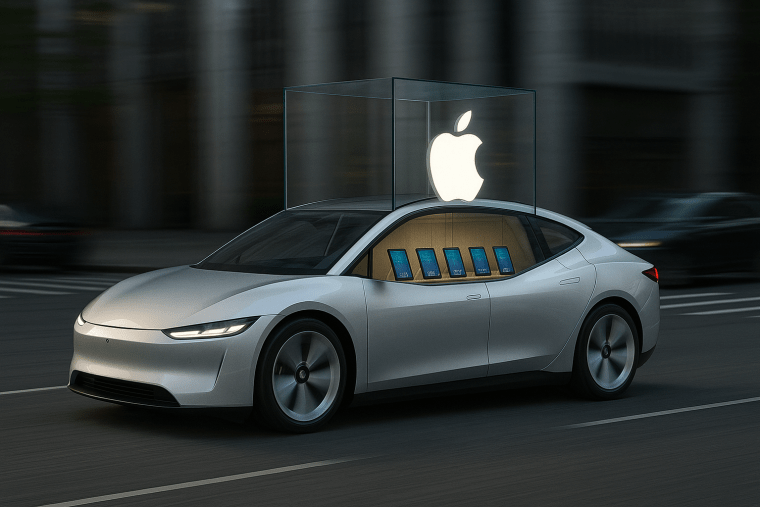
The resurgence of physical controls is not just about safety or nostalgia, it is about rethinking what automotive luxury and elegance really mean. For a while, a certain mindset prevailed in car design: that a clean, screen-dominated interior was the epitome of modern luxury, much like an ultra-minimalist smartphone or a slick Apple Store aesthetic. But many of us never bought into that premise. Not all drivers want their car to feel like a giant iPhone or a tech showroom. There is a growing recognition that a car’s interior can be high-tech and warmly tactile at the same time, and in fact that might be the ultimate luxury. True luxury is an interface that is effortless and intuitive, anticipating your needs without demanding all of your attention. Often that means a sculpted knob that your hand finds without a glance, or an etched metal toggle that gives a satisfying click, details that delight the senses in a way flat glass never will.
Even high-end automakers have come to emphasize this. When Mercedes’ design chief says “big screens are not luxury,” it is a recognition that anyone can slap a huge display in a car, but it takes real artistry to integrate technology seamlessly into a car’s soul. Luxury, in other words, is not about how many inches your center touchscreen measures. It is about thoughtfulness and craftsmanship, the smooth action of a dial, the tactile notch of a volume wheel, the confidence of a real button under your fingertip when you need it. A dashboard full of identical glossy screens, devoid of physical feedback, can feel cold and disengaging. It might impress your tech-geek friends for a minute, but as Wagener notes, you probably have a better TV in your living room. Meanwhile, what truly makes a car’s interior special can be the stitching of the leather, the mechanical precision of switchgear, the way form and function meet. An all-touch interface, for all its futuristic vibe, risks reducing a car to just another gadget. Many enthusiasts would argue that a car should be a sanctuary from screen overload, not another source of it, a place where driving remains an analogue joy aided by digital convenience, not smothered by it.
Crucially, tactile controls also reconnect the driver with the driving experience. Pressing a real button or turning a knob can create a small but meaningful bond between human and machine: a reminder that you are in control, commanding a complex mechanical beast with direct inputs. In a performance car, for example, the physical act of flicking a switch to change driving modes or hitting an engine start button on the wheel, a feature Ferrari is proudly bringing back, can be an exhilarating ritual. It engages the driver and heightens the sense of occasion. Compare that to digging through touchscreen menus: it is about as inspiring as adjusting settings on a laptop. As vehicles become ever more digital, the return of analogue touchpoints is a way to preserve the emotional, human side of driving. It proves that sometimes, the old ways, if refined and executed with modern quality, can coexist with new technology to make a better product.
So let us dispense with the notion that a car must resemble an Apple Store on wheels to be cutting-edge. Luxury is not a one-size-fits-all tablet interface. For many of us, luxury is having controls that respond instantly and predictably, without fuss. It is the serenity of being able to change the radio or adjust the AC by feel, instead of pawing at a glass screen and hoping you hit the right virtual button. It is the elegance of a cockpit that communicates information at a glance with well-placed gauges and lights, rather than demanding constant interaction with a touchscreen UI. The highest praise might be that a well-designed car interior lets you forget about the interface altogether: you think about what you want to do, and your hand almost instinctively finds the right control. Achieving that kind of simplicity is an art, one that the best automakers are rediscovering by reintroducing physical elements into their designs.
In Praise of the Physical Button
The humble button, it turns out, is no anachronism. It is a triumph of form following function, a little piece of user-centric wisdom that still has a home in the modern automobile. We have seen that the march toward all-touch, all-digital car interiors was not the unqualified improvement it was touted to be. Yes, touchscreens brought new capabilities and a slick look, but at the cost of distraction, usability, and a certain tactile soul. Now, as studies highlight the dangers and drivers voice their displeasure, the automotive world is coming full circle. Regulators are pushing for sanity, and carmakers are admitting that in the rush to imitate smartphones, they forgot the point: a car is fundamentally a driving machine, not a mobile phone with wheels.
By singing the praises of physical buttons, we are really advocating for balance. No one is saying to toss out touchscreens entirely, they have their place for navigation maps, backup cameras, and other advanced functions. But the pendulum had swung too far. It is encouraging to see brands like Volkswagen and Ferrari eat a slice of humble pie and bring back the tactile interfaces that never should have been removed. It is refreshing when a company listens to its customers, and its own common sense, rather than doubling down on a mistake. And it is downright poetic that the solution to our high-tech woes was there all along: the satisfying click, the intuitive knob, the button that just works.
In the end, the return of buttons is a win for safety, a win for drivers, and a win for driving as something to be enjoyed rather than managed. It proves that progress in car design is not about chasing every tech fad, it is about making the driving experience better. Sometimes that means embracing new technology, other times it means recognizing the enduring value of a tried-and-true idea. The button is back, and not just out of nostalgia. It is back because it belongs in our cars, keeping us safer and more connected to the drive. So here is to the humble button, making a heroic comeback in the digital age, a small victory for sanity on the roads, and a reminder that newer is not always better. After all, it is a car. It is not a phone. Let us keep it that way.